Our Work
R Coffee Camden
Heather came to us for help with taking her hobby business that she started from scratch, and make it more marketable to a wider audience. She wanted to be taken more seriously in the world of holistic practices, thus taking her from small time cystal and Jewellery seller to being accepted into more markets with larger crowds and having a income generated from her online shop.
Kids In Tuition
Client.
Lesley Tehliwec – Owner Kids Intuition
Lesley came to us for help as she was running a franchise under Begin Bright and was given the opportunity to rebrand under her own name.
The Logo Identity.
We did a brand strategy workshop together and really identified who her target market was. And it is the parents but in this case, the branding still had to make the kids feel at home and feel that this was a place of fun and learning. We feel we definitely achieved this.
Propt Me App
What it basically is, is an app that you rent out something you have or a service you can offer. Jenny and Brendon’s passion is to simply “Propt” up people. They just want to help everyone make money for renting their stuff out and help reduce landfill by encouraging people to reuse, rent our or hire items instead of purchasing and discarding.
Humble and Honest - Wholesome Products
Logo/Branding.
We wanted to have the logo really strong. The gold is to communicate how luxurious the product is. The X is to represent hair/hair colour.
Website - Online Store.
This website is an ecommerce store. Hair Extensions and related products have become really popular, Deluxe wanted to take advantage of this and have a website to purchase from. We have focused on the customer journey to make the whole shopping experience really quick and easy.
The Little Workshop - Jewellery
Logo/Branding. Barry had a specific idea for his logo. He wanted a diamond in his logo. We came up with the idea of having the diamond shape doubling as the W for Workshop. This idea, he loved.
Business Cards/Printing.Business cards are really important for a jewellery shop. We spent time researching the best way to print the business cards to represent the business. We decided to do a gloss laminate just on the black logo and leave the white space matt. The effect looks amazing.
The Australian Botanic Garden
We have had the pleasure of working with The Australian Botanic Garden since 2012. We have helped them from the start of a project - the creative to the output files/printing of advertising and marketing collateral.
Lane and Acre
Lane and Acre is all about providing people with beautiful collated items that all work together in your home, but most important to Ellen is that she supports local businesses and artists with their craft.
Walkden Law and Mediation
Walkden Law & Mediation supports the local community with a wider range of expert legal support. They specialise in helping you with your Family,Children and Family Dispute Matters, Mediation, Conveyancing, Wills & Estates and Criminal Law.
Melanie Redman Design
Melanie, having a very good eye for detail of course had a very specific idea in her head of what she wanted. She really embraced the personal branding direction and came up with the idea of having her logo with her Signature/Initials in the background.
We provided her with a few concepts based off this idea - scroll down to see.
Guilty Or Not Cafe
Ayesha had an incredibly strong vision of what she wanted for her Gelato/Smoothie Cafe. She told me about how she wanted the logo to be reminiscent of the Guilty Stamp from Jail. Then she wanted to logo assets designed as the angel and devil as she offers healthy and not so healthy treats.
Bright Sparks Early Learning
The logo is now over 12 years old. The brief was “fun, playful, colourful” They wanted to communicate that they were a fun childcare centre. So I went with a handwritten font, like a 4 year old would do. The logo branding for the new centre was just turned into one colour - white for some of the signage to be a little more contemporary and communicate the new centre’s vision.
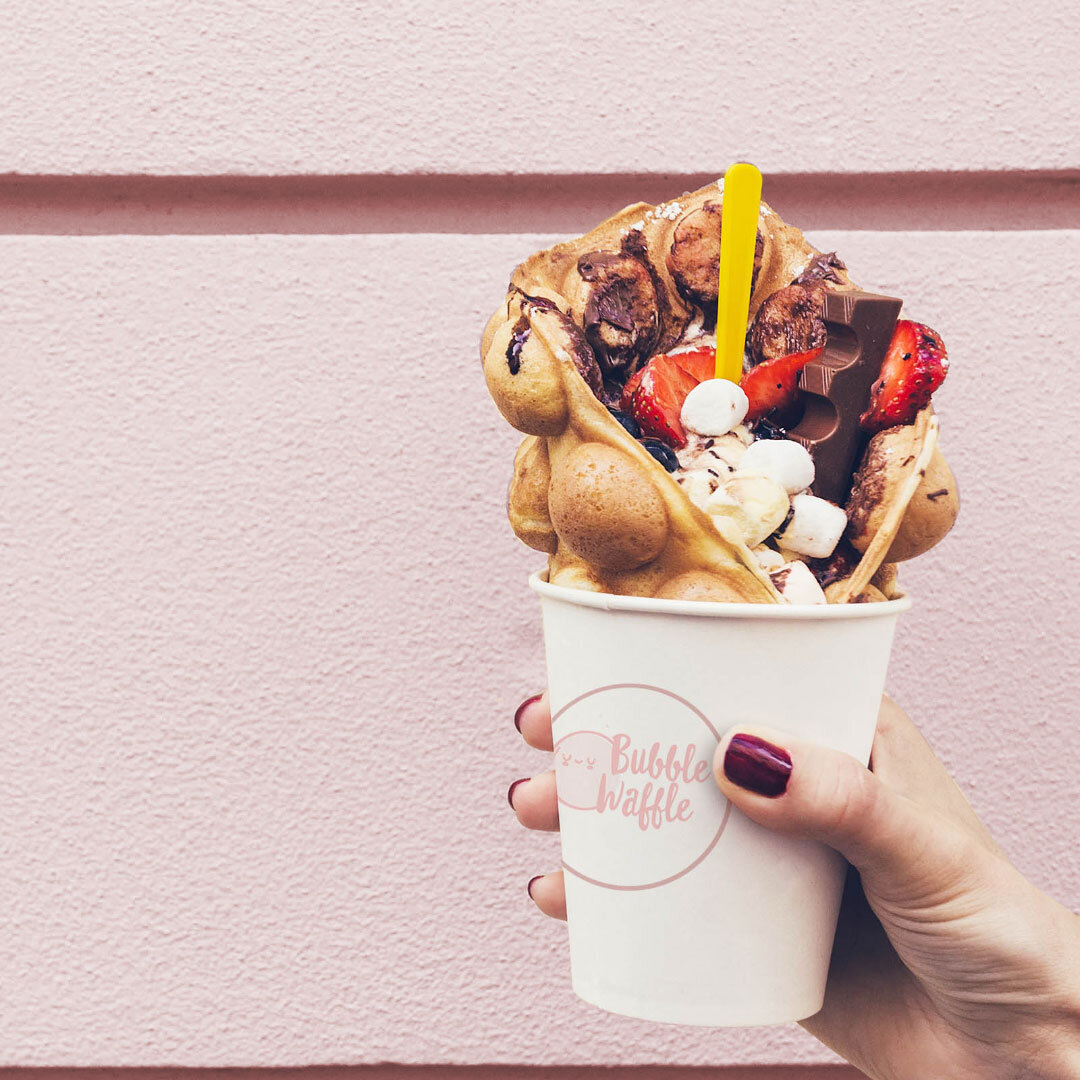
Bubble Waffle Food Truck
The brief from our client was “ Fun, quirky and really contemporary”.
We came up with the idea of having the typography (bubble waffle wording) look like waffle mixture before it’s cooked. The we wanted to communicate the bubble part of the waffles so we designed the bubble character icon. As you can see below, we did multiple concepts (which we always do) and the one on the cup was chosen.
Cedar Creek Cider
We delved into Nathan’s ideal customers personas and then did market research on the cider space and competitors.
Problem to Solve. Nathan came to us, just as he was starting up his boutique cider business, located on his parents farm Cedar Creek Orchard. Nathan had a very strong vision of what he wanted for his packaging design his brief to us was extremely bright colourful and fun. We spent time researching competitors in the cider game and then provided Nathan with some pretty out there concepts.
Magick Earth Crystals
Heather came to us for help with taking her hobby business that she started from scratch, and make it more marketable to a wider audience. She wanted to be taken more seriously in the world of holistic practices, thus taking her from small time cystal and Jewellery seller to being accepted into more markets with larger crowds and having a income generated from her online shop.
Gin Lane Sydney
Gin Lane Sydney is a Bar that specialises in cocktails using the finest quality Gins from around the world. Located in Chippendale.
What they needed. Grant wanted a flavour pairing wheel infographic designed to help patrons with choosing their drinks.
Tayta May's Lebanese Salad Dressing Packaging
Our client wanted his mother as the main symbol/icon for the logo. We created a few concepts based on a minimalist approach. We wanted her to look loving and bright and colourful. Then carefully studying fonts with a Lebanese look, we found the perfect font that had a hand made feel to it.
Doolan Country Jams & Chutneys
Pam and Paul already had a well established brand with regular returning customers as they had built their business up by doing markets. But they wanted to expand their business by getting their product line into retailers/wholesalers.
Alkalizer Restaurant
Shefali came to me with her idea for her restaurant. She had the location, the name and alot of research behind her. Her unique idea and vision for Alkalizer was for her restaurant to be a community hub for people to feel welcomed, healthy and inspired.
Marketing. She wanted much more than a logo and marketing material, she wanted a marketing plan for her pre launch, launch and first 6 months. Packaging. She also has so many beautiful products such as teas, chocolate and coffee that she wanted beautiful and unique packaging for.
Want to grow your business? Let’s chat.
Request a call-back by completing the form below, or book a free 30-minute consultation with me here.


